
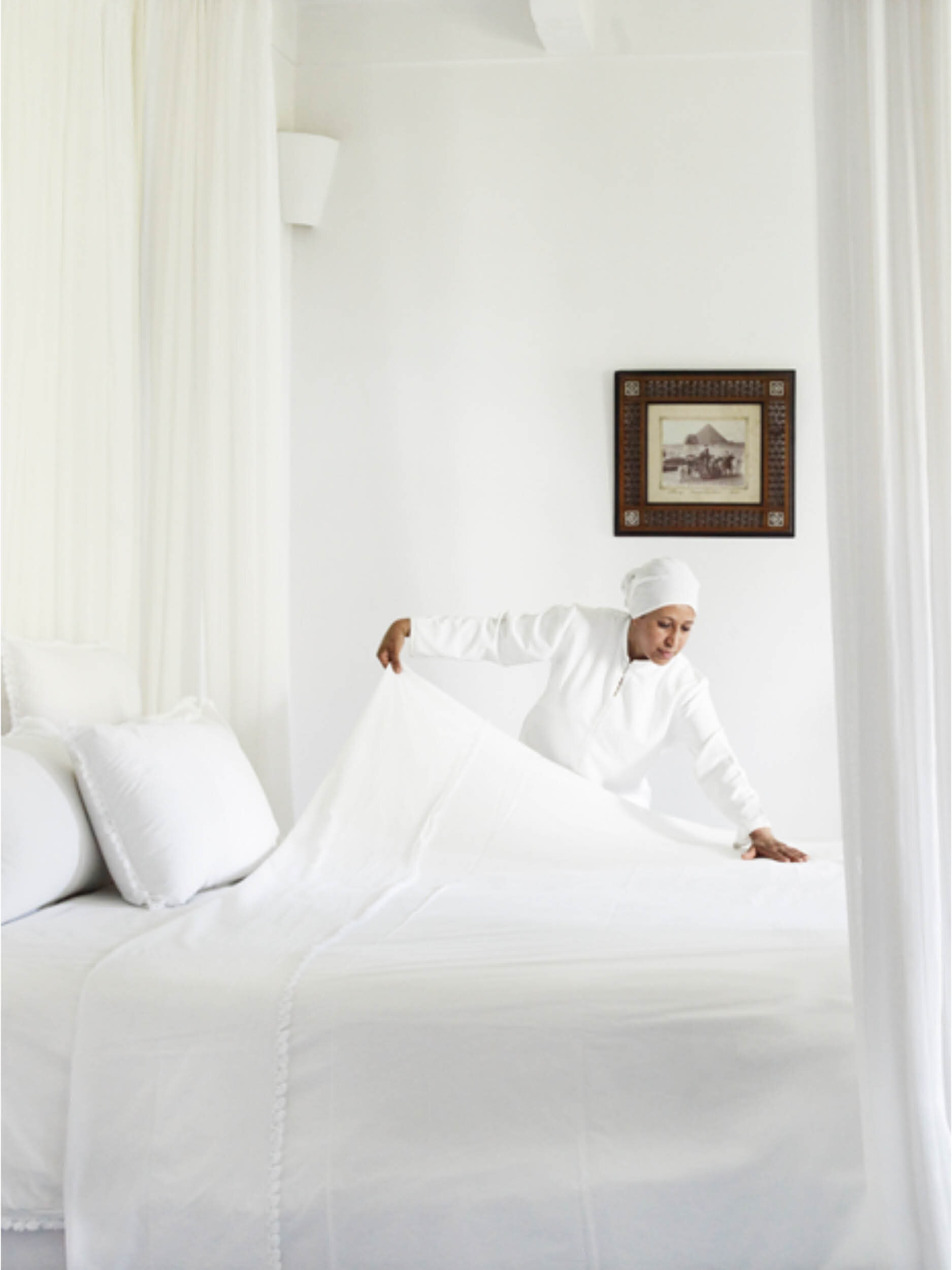
Not All Whites Are White


For all the years we’ve been selecting colour, I am always amazed by the trickery of the colour white, a neutral or white scheme should be so simple but the fact is, it’s a lot harder than it seems. There is a delicate balance between sterile, boring interiors lacking any imagination, to creating spaces that are textural, interesting and beautiful to the eye.
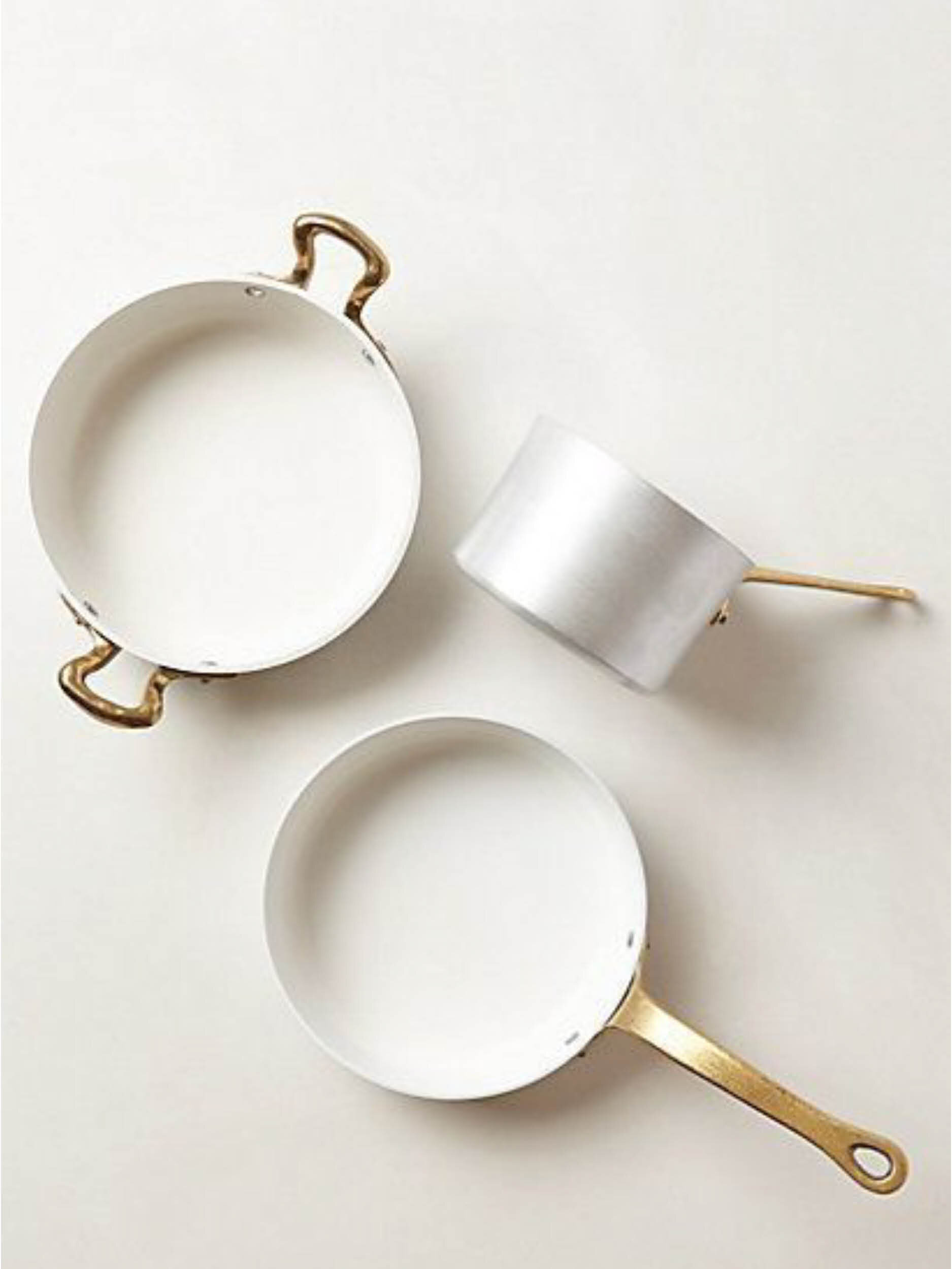
We recently completed a very luxurious apartment for a client who knew exactly what he wanted - his brief, ‘I prefer all white interiors’. For our team at VH that meant white walls and white textual wallpaper, luxury white performance fabrics on sofas, silver metals, white artwork (yes, do you know how challenging it is to find white artwork!), white curtains, cushions, bedding and accessories. The challenge was real, white is not always white!
We have received so many requests from our forum group and email requests asking how to choose the right white paint, so we thought we would share with you our process when choosing the right white for your home.
Not All Whites Are White
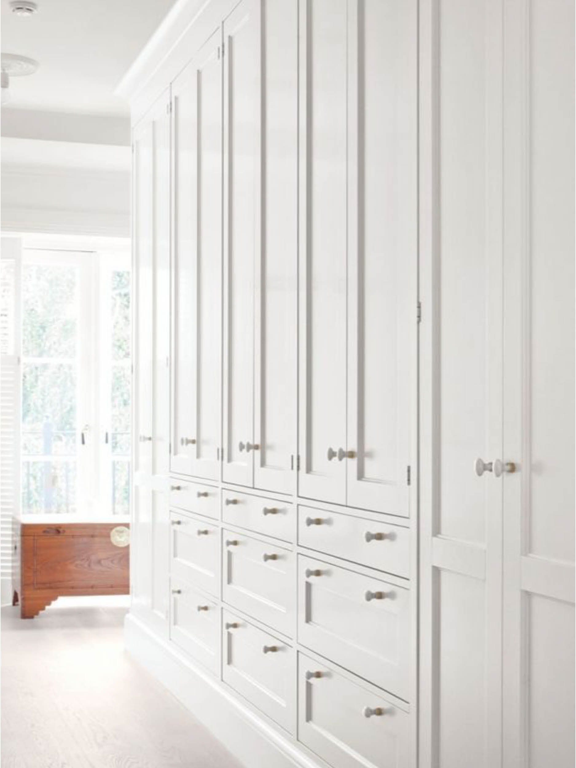
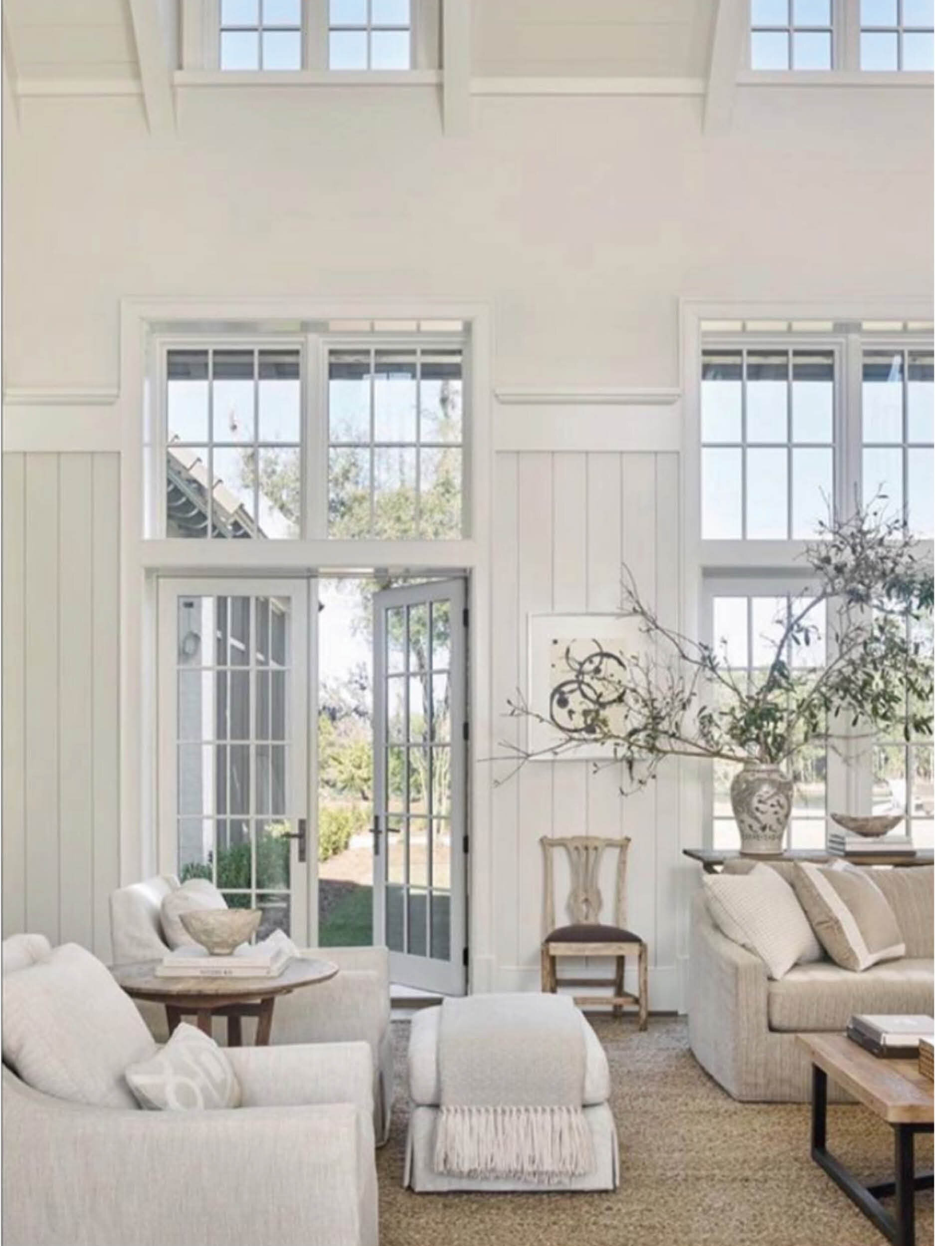
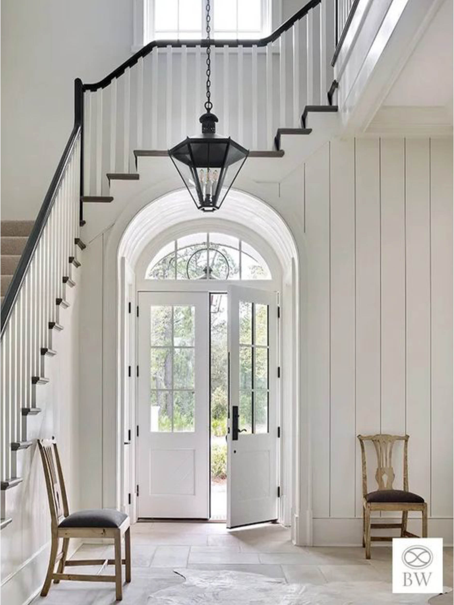
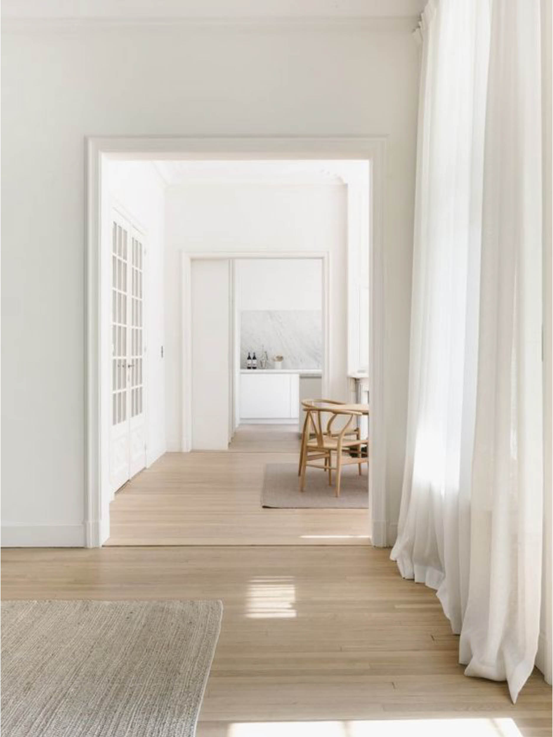
It doesn’t take an expert to know not all whites are white, the options are endless, the differences often so subtle but can have such a profound effect on the look and feel of a room. Natural light has a big impact on the colour of white you choose. If your room is filled with lots of natural bright light, then you’re best to avoid white with yellow undertones. If your room needs brightening up, choosing a warmer white will help you lighten the room. There are two types of whites to consider; warm whites and cooler whites both have different undertones and can help set the mood of the room.

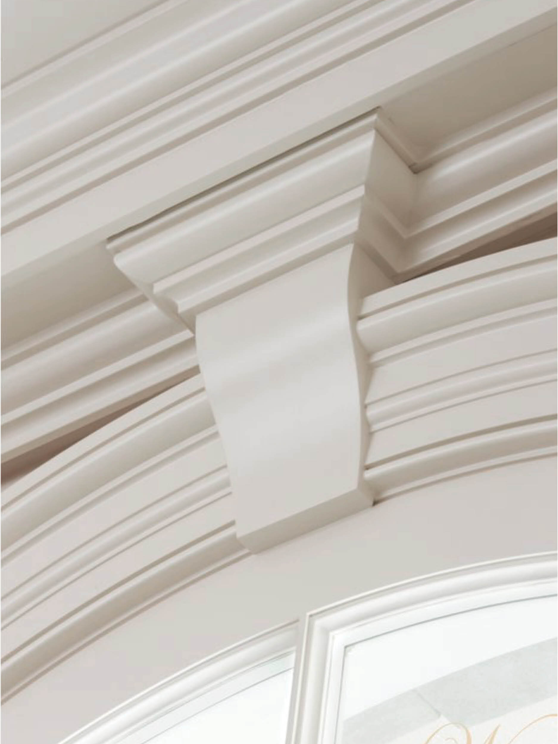
Whites We Love To Use
We are the first to admit when we find the right white paint colours we tend to stick with them because simply why change a good thing! So we thought we would share with you some of our favourite whites.

If you're looking for a warmer white but you still want the freshness, try one of our go-to favourites, Dulux Natural White. Whilst on the lighter side of a warm white it’s probably our most used white for our projects for its timeless appeal and ability to complement beautiful furnishings and details.
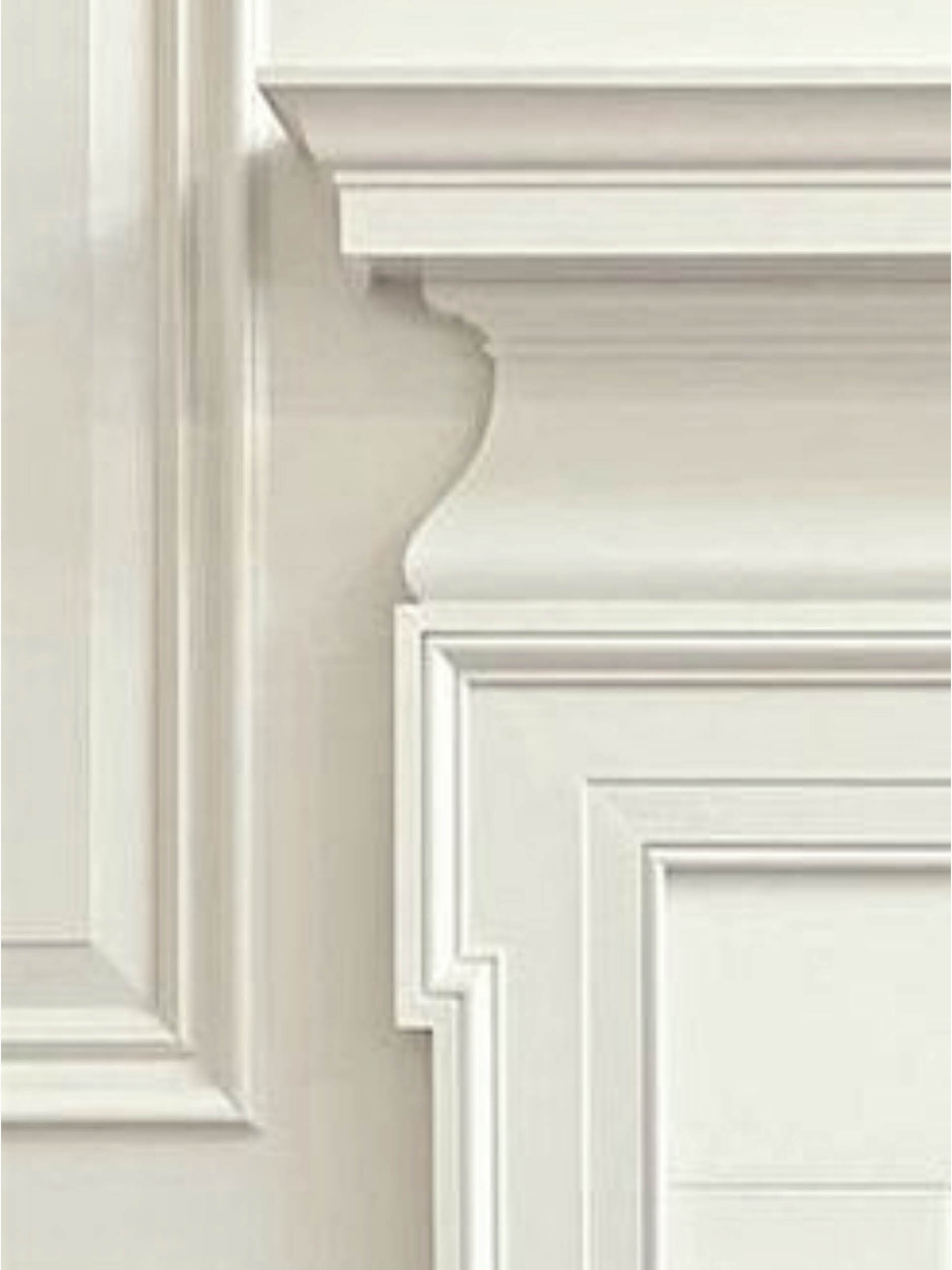
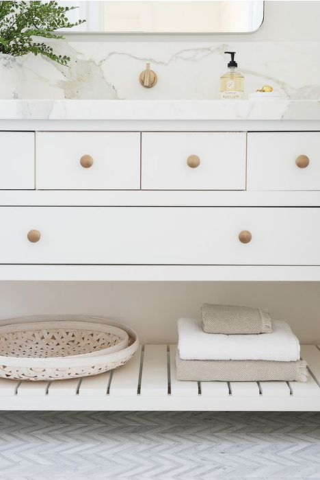
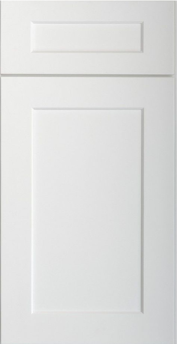
Resene Alabaster is another favourite, similar to Dulux White on White, we have been using this white for sometime. It always turns out to be the perfect white, it has enough warmth to not look stark, but enough coolness to give a clean fresh look and particularly looks great used on joinery, panelling, trims and doors. Gloss it up on trims, low sheen on walls. When designing beach house interiors, apartments, even classic homes, this white seems to be our client’s favourite choice too.
Porters Paints Byron White, named after our favourite beach side town, this white is fast becoming another favourite of ours, for its versatility, subtle warmth yet it's crisp and modern. Aside from probably being our go to beach house colour, it works back beautifully with rustic timbers, wicker and sisal. It’s a blank canvas for colour and amazing artwork. We also love that we can purchase the paint in different textural finishes to achieve that perfect rendered finish on walls.
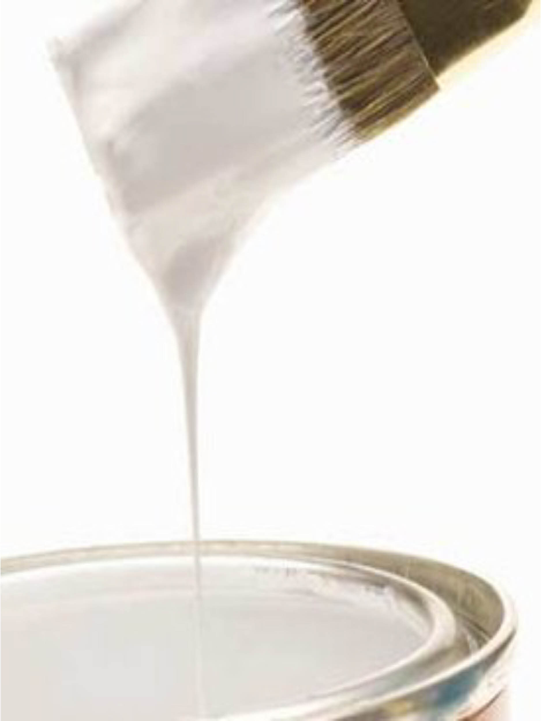
Sampling Is Essential!
It sure is a costly mistake to buy the wrong white paint and worse yet if you need to pay to have it redone. With 100’s of white paint options out there to choose from, getting the right white is going to take more than just looking at small paint swatches that really don’t show the colour correctly. Our suggestion choose your top three white paints, then purchase sample pots of these whites and brush them out on large sheets of cardboard. Apply two or three coats and allow the paint to dry before applying the second. When dry, move the sample boards to the different rooms in the house, the colour will change ever so slightly and gives subtle contrast against different materials and light. You can order A4 paint swatches and whilst that is a good option, we still prefer sampling the actual paint. If you apply onto gyprock or ply unless the walls are prepped with an undercoat the grey of the walls can really throw off the colour and doesn’t allow you to move the colour from room to room.